Intuitive Navigation: Best Practices for eCommerce Stores
Shoppers who cannot find a product cannot buy it. This Insight covers the navigation that gets people from your homepage to the right product page. That means simple menus, a clear category structure, mega menus, search, breadcrumbs and filters.
Key Takeaways
-
Keep the main menu short and label it with the words your customers use, so shoppers can scan it at a glance.
-
Build a clear category hierarchy and keep navigation in the same place on every page.
-
Design for mobile first, with visual cues that show shoppers where they are and what they can tap.
-
Strong search, breadcrumbs and filters help shoppers narrow a large catalogue down to the right product.
Why Intuitive Navigation Matters on an Online Store
Navigation is how shoppers move through your store. When it works, people find the category they want, compare products and reach the product page without thinking about it. When it does not, they hit dead ends, use the back button or leave.
Good navigation also builds trust. A store that is easy to move around feels well run, and that confidence carries through to the checkout. Navigation is a core part of user-centred design. It starts from how your customers shop, not from how your stock is organised in the back office.
Simplify and Prioritise Menu Items
Every extra item in a menu is another decision for the shopper. Too many options slow people down and make the key categories harder to spot. Keep the top level to the categories shoppers actually shop by, such as New In, Clothing, Accessories and Sale.
Labels should describe what is behind them in plain words. Avoid internal jargon and clever names that only make sense to your team. Descriptive labels help shoppers, and they also give search engines a clearer picture of your site structure.
Group related items under a small number of parent categories. Put your core ranges first, so the most important pages are always one tap away.
Logical Hierarchy and Structure
A logical hierarchy shows shoppers and search engines which pages matter most. Start with broad categories, then break them into subcategories that match how people narrow their choice. For example: Clothing, then Dresses, then Midi Dresses.
Keep the structure shallow where you can. Each extra level is another click between the shopper and the product. Clear labels and consistent grouping help people understand how sections relate to each other.

Sitemaps are crucial for defining website structure and hierarchy. At Dazze Studio, we consider them a cornerstone of every project, ensuring a solid foundation for navigation and user experience.
Utilise Visual Cues
Visual cues show shoppers where they are and where they can go. Icons, arrows, typography and colour all guide attention towards the next step.
Use colour and size with purpose, so key navigation elements stand out. Highlight the active menu item or page, so shoppers always know their current location. Familiar icons such as basket, account and search are recognised quickly and save space.
Hover and tap states give instant feedback that an element is interactive. Small details like these make a menu feel responsive and easy to use.
Optimise for Mobile Devices
Many shoppers will see your navigation on a phone first, so design for small screens from the start. Responsive design keeps navigation usable on every screen size. A mobile-first approach also forces you to decide what really matters.
The hamburger menu is the standard pattern on mobile. Keep what sits inside it short and well ordered, with the main categories first. Make the search bar easy to reach, because search is often the quickest route to a product on a small screen.
Use large tap targets. Avoid deep, nested menus that are hard to use with one thumb.
Enhance Search Functionality
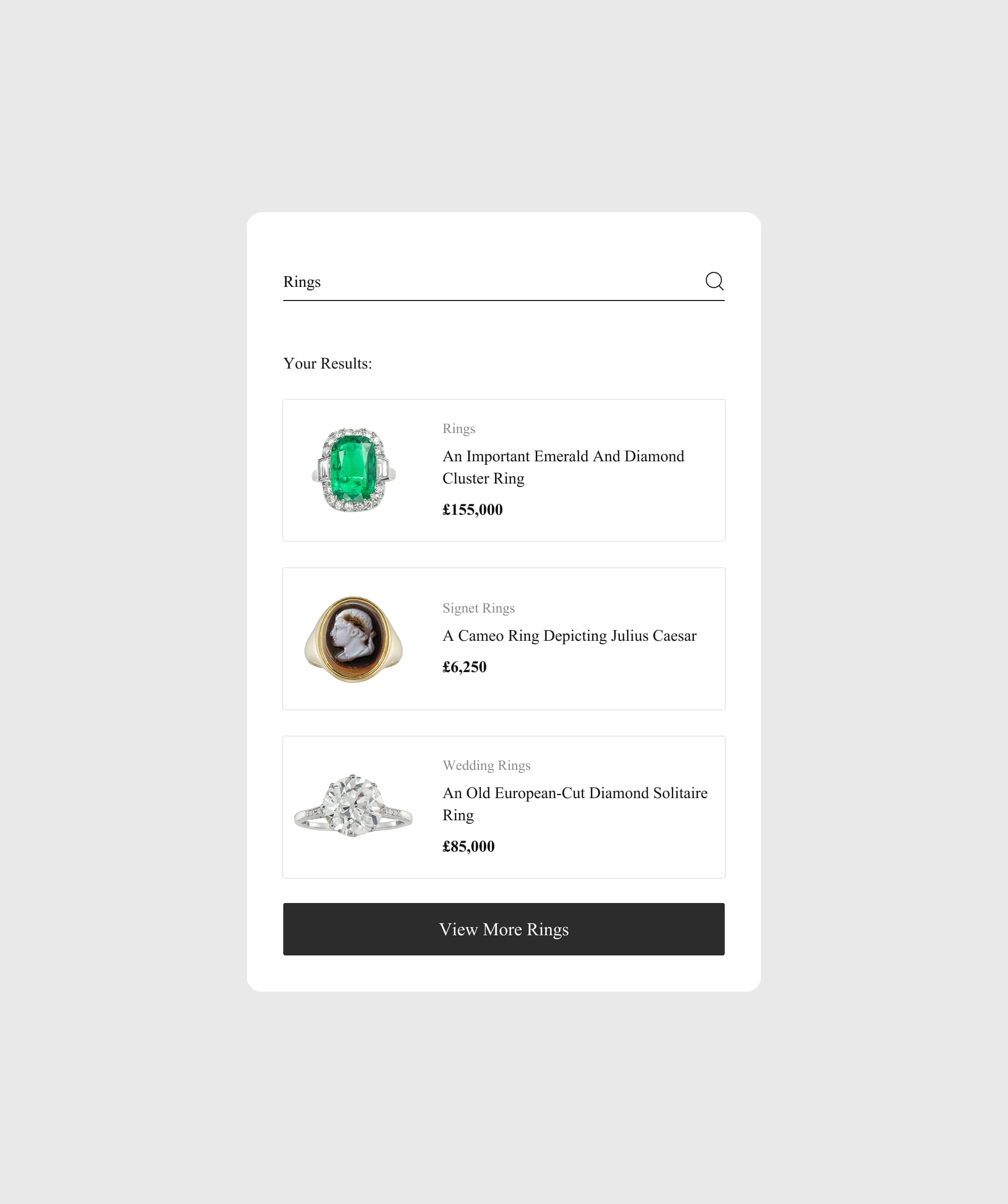
Search is often the fastest route to a product, especially for shoppers who already know what they want. Make the search bar visible on every page and on every device. Good site search should include autocomplete suggestions, filters and tolerance for typing errors.
Autocomplete helps shoppers refine their query as they type. Typo tolerance catches misspellings and suggests corrections, so a mistyped search still returns products. Natural language processing can improve results further by understanding what the shopper means, not just the words they type.
Personalised search results can surface products based on what a shopper has viewed or bought before. Showing images and prices in the results also helps people spot the right product quickly.
Incorporate Breadcrumb Navigation
Breadcrumbs show shoppers where they are in your store, for example Home, then Clothing, then Dresses. They are especially useful on stores with deep catalogues, where a shopper may land on a product page straight from Google.
Breadcrumbs also help search engines understand how your categories relate. Our guide to eCommerce SEO covers the other structural decisions that help category and product pages rank.
Breadcrumbs give a quick route back to the parent category without the back button. Keep the design simple and unobtrusive, but easy to see. On a product page, the trail back to the category is often the fastest way to keep browsing.
Effective Use of Dropdown Menus and Mega Menus
Dropdown menus keep a large amount of content tidy. They show subcategories only when a shopper asks for them, so the main menu stays short.
Mega menus suit stores with many categories. They show several categories and subcategories in one panel, giving shoppers an overview of the whole range. Use descriptive labels and an organised layout, so the panel does not become a wall of links.
Images and product highlights in a mega menu act as visual cues. They draw attention to new arrivals or key ranges. Make sure every dropdown and mega menu also works well on mobile, where there is no hover.

The mega menu we designed for Gentlewench paired category and product highlights with subcategory links to key shopping pages, guiding shoppers straight to new arrivals.
Efficient Filtering and Sorting
Filters and sorting help shoppers narrow a large range down to a few products. Common sort options include price, newest and best selling. Filters let shoppers refine by size, colour, price, material and other attributes.
If results refresh after every selection, show a short loading state so shoppers know the page is updating. On mobile, many stores let shoppers choose several filters and apply them in one go. A Clear all button lets shoppers reset their choices with a single tap.
Show how many products match the current filters. Display active filters as small chips that can be removed one at a time. These details help shoppers find their way through large catalogues.
WooCommerce and Shopify both support product filters, natively or through extensions, so the real work is choosing attributes that match how your customers shop.

In the discovery phase, we identified the need for a structured filtering system for Bentley & Skinner's jewellery. We implemented a custom solution on the category and search pages to enhance the shopping experience.
Consistent Placement of Navigation Elements
Keep navigation in the same place on every page. Shoppers expect the main menu at the top, with search, account and basket icons in the header. When these stay put, people learn your store quickly and browse with confidence.
Consistency also supports accessibility. Navigation should have a logical order, a consistent layout and full keyboard support, so every shopper can use it.
Common Navigation Mistakes to Avoid
The most common mistakes repeat the points above: too many menu items, vague labels, and missing visual cues such as active and hover states. Each one makes shoppers work harder to find a product.
Two more are worth checking. Ignoring accessibility can make your store difficult or impossible to use for some customers. Launching a navigation design without testing it means you only find the problems once they are costing you sales.
Test and Iterate Based on User Feedback
Navigation is never finished. Test it early, then keep testing as your range grows. A/B tests, heatmaps and session recordings show where shoppers hesitate or give up.
Tools like Hotjar and Google Analytics show how people move through your menus and which pages they reach. Pair that data with direct feedback from customers. Keep a record of each change, so you can see what worked.
Summary
Intuitive navigation helps shoppers find the right product with less effort. Simple menus, a clear hierarchy, strong search, breadcrumbs and well designed filters all play a part.
Get the basics right, design for mobile first and keep testing as your store grows. Navigation that matches how your customers shop is one of the most direct ways to help more visitors reach a product page.

Not sure where shoppers get lost on your store? Our eCommerce Consultancy reviews your navigation, search and filters, then gives you a prioritised list of fixes.
Frequently Asked Questions
Why should the navigation menu be simplified?
A shorter menu is easier to scan. Fewer options mean fewer decisions, so shoppers reach the category they want faster.
How does a logical hierarchy benefit website navigation?
It shows which pages matter most and how sections relate to each other. Shoppers find products faster, and search engines understand your structure better.
What role do visual cues play in navigation?
Visual cues guide shoppers towards key actions and show where they are in the store. Active states, icons and hover effects all make navigation easier to follow.
Why is mobile optimisation important for navigation?
Many shoppers browse on their phones. Navigation built for small screens, with large tap targets and easy to reach search, keeps them moving towards a product.
How can testing and iterating improve navigation?
Testing shows where shoppers hesitate or give up. Fixing those points, then testing again, keeps your navigation working as your store grows.